Kentico Software

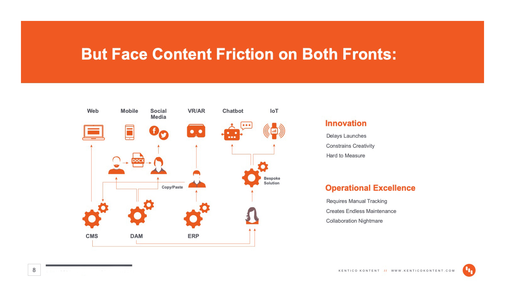
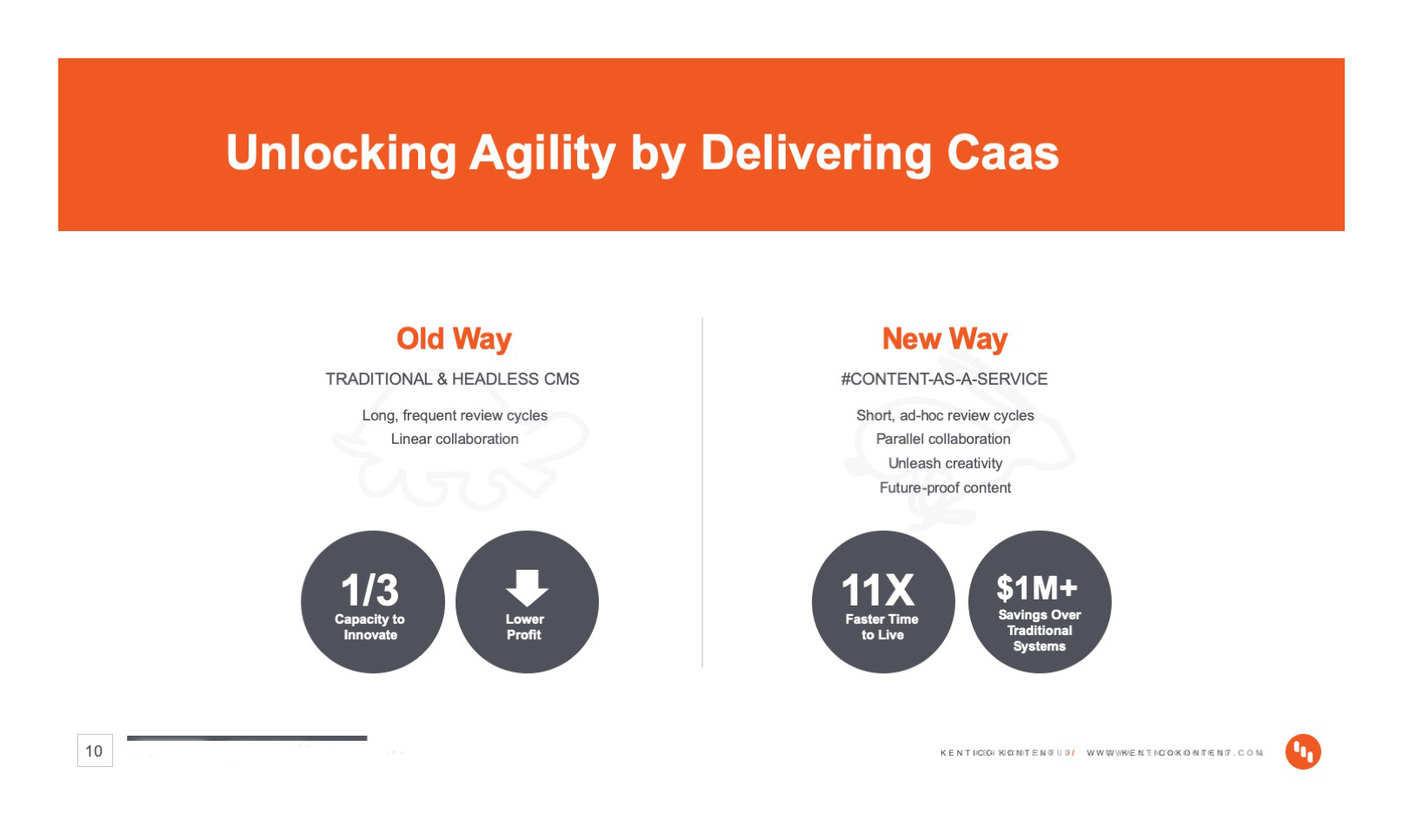
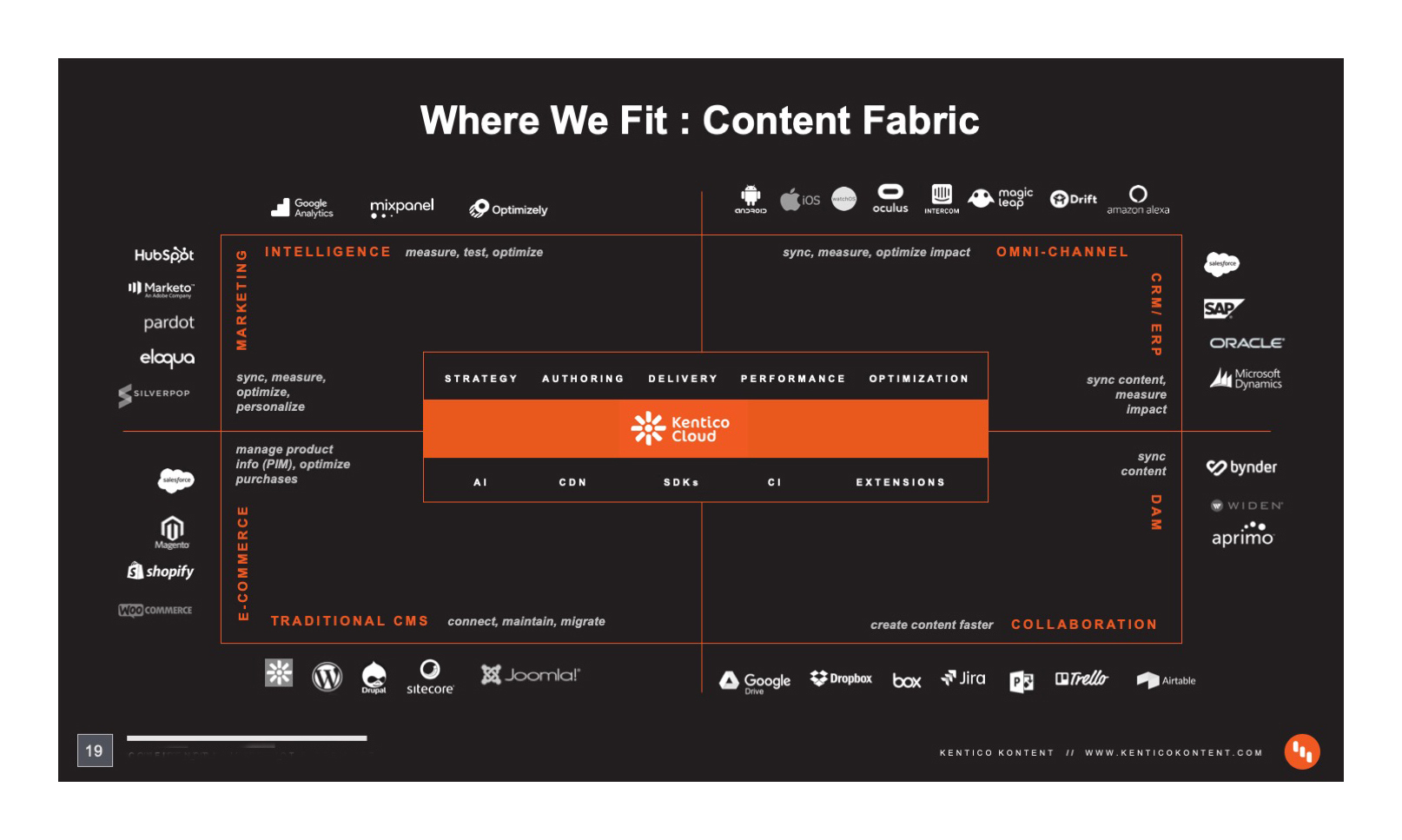
Founded in 2004, Kentico Software is a Microsoft Gold Certified Partner headquartered in the Czech Republic with offices in the US, UK, Netherlands, Australia, and Singapore. Kentico Software has 1,000 digital solution partners and powers 25,000 websites across 100 countries. Back in 2014, they realized that the traditional CMS (Content Managment System) model wouldn't be enough for the future needs of large enterprise organizations, so they started working on a new headless CMS that was later released as Kentico Cloud. In 2019 Kentico's vision had grown beyond the technical benefits of the headless model. Their primary focus was now on the content production process. They sought for a better way to manage content - and how to do it at scale. We called it delivering Content as a Service (CaaS) with a new mindset on how to collaboratively create, manage, deliver, and track content.
Kentico Cloud also had a new name Kentico Flow. Through one-on-one research and testing we discovered the new name, except for parody in disseminating information within all CMS, lacked strategic relevance or logic to the brand and product. Flow, like Cloud, was nomenclature used by competitors and tech companies in a variety of categories. So, we reopened the naming process, added strategic name generation testing and targeted research analysis. The result? A unique, own-able, branded product name: Kentico Kontent.
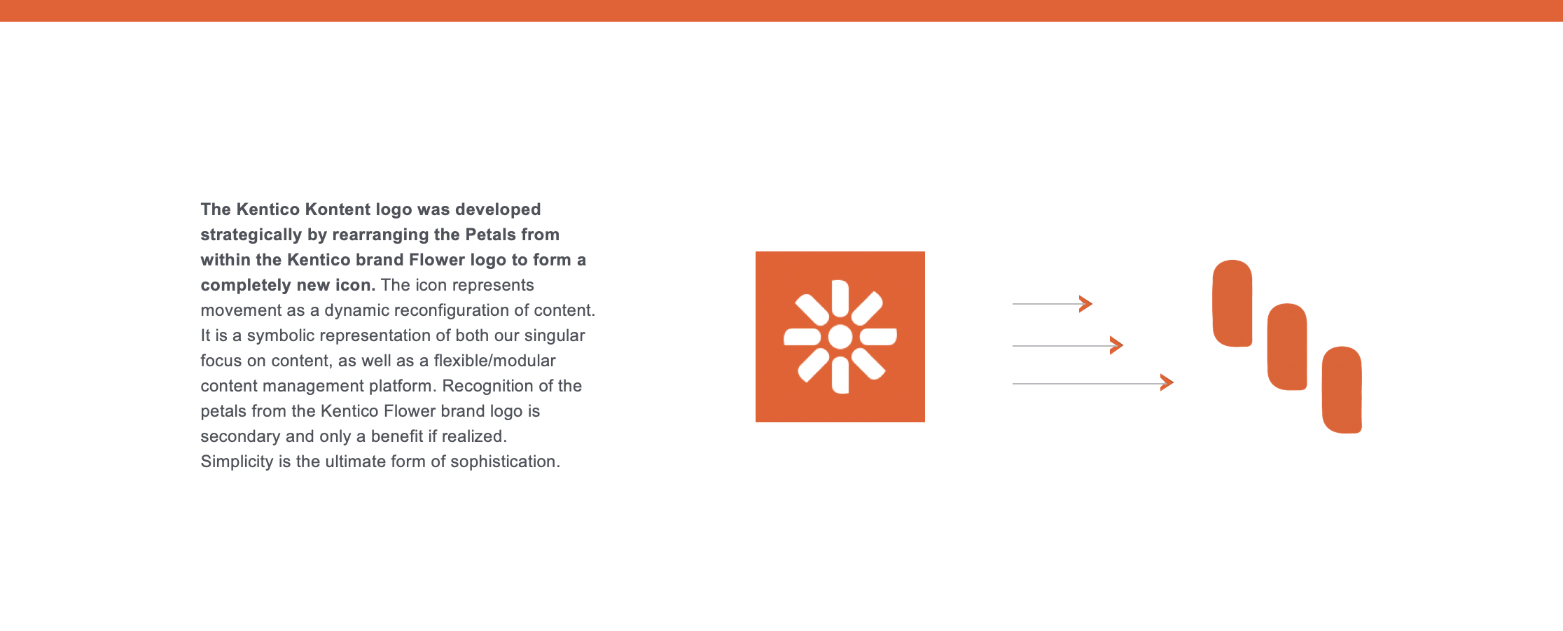
By branding Kentico's CaaS product with the letter K, we planted a flag in the CMS category. Adding punctuation, a period, to the end of the new name cemented the thinking. Kentico "Kontent." gave potential users a clear and immediate understanding of the products core competence, differentiating it from the competition and defined an own-able platform from Kentico's other software products. We then created iconography using elements, petals, from Kentico's existing flower logo. The new Kontent Petals icon symbolically represented an information stack during the CaaS delivery process visually demonstrating the product's technology. We further connected the product to the brand by simplifying their rainbow ‘esk color scheme leveraging only the brands primary color, blaze orange. A monochromatic color scheme streamlined the platform and all communications internally and externally. Guidelines including: color theory, typography, photography, digital and traditional, as well as, the company manifesto, sales decks, product, web development strategy and internal communications were developed.
Kontent.ai became the destination and the product had a straight forward marketing strategy: 'a headless CMS that is focused on enterprise customers who want to collaborate on content across the organization and reuse it in any channel.'
Top-line data for the rebrand:
Logo and Name:
44% of senior decision makers found the rebrand “extremely” to “very” appealing.
Sales impact:
30% increase in revenue per month
Kontent. rebrand results:
67% found the name innovative
61% found the name creative
67% found the name advanced
45% found the name professional
70% found the logo innovative
Please see the charts below for a detailed breakdown of the rebrands success, analytics, key performance indicators, metrics and measurements.

