Widows and Orphans. Rags and Rivers. (1) Typography fundamentals are lost on most Ui / Ux designers, web designers, products designers and digital designers. Why? Most never had the good fortune of attending a core fine arts program or trade school to learn the craft of graphic communication which includes in-depth typography. Typography goes into detail on font characteristics (stroke widths, x-heights, serif qualities, leading, kerning, etc.) and how these affect usage and emotional impact. (5)
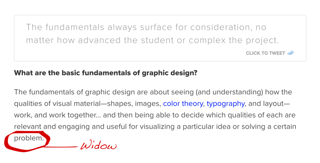
The Widow is a line of text at the end of a paragraph that stands alone at the top of the following page/column. A Widow can also be a single word that ends a paragraph/sentence/headline, etc. that lives on a line all its own. These errors are common with web designers. They simply do not know to avoid them, because they never studied typography. They also do not know how to fix them when they're pointed out. A good copywriter will rewrite a section by adding, deleting a word or phrase to eliminate the issue, but they need to be involved in the design process. It's one reason I have "Crits" or critiques (2) with our team and it includes the writer or writers. We work together on the project to improve the final product. Crits are not just about the bad, but also about celebrating the good. It's great for building a team instead of just a department.
Fundamental graphic design mistakes dilute a design aesthetic and overtime negatively effect the standing of a product and brand within a category.
Web designers, screen designers really, have a tendency to do vs learn too. For good reason too. They are focused on the design system created to simplfy and unify the work. Repetitive approaches are made into templates for consistency sake. There is logic in this, but it also tends to stifle creativity. More and more tall sticky headers can be seen on websites. “Branding blocks” and navigation menus that have a fixed position and take up a significant amount of space. They stay glued to the top of the browser window (the “sticky header”) and often block the content as it scrolls underneath them. (4) A comfortable if not boring approach that in 10 years will be frowned upon. Challeging UX designers to think outside the preverbial box is surprisingly, well challenging, but once they see that responsive design techniques make it possible to design different solutions for different platforms they respond positively. Designers should use their best judgment and not be afraid to innovate, but to ensure great website usability it would serve them well to test their design thoroughly with real-world users.
Another common mistake Ui / Ux designers make is using sans-serif fonts for longer copy instead of the easier to read serif fonts. Color theory is also an issue as contrast as they have not been trained in complimentary colors. The fine balance of color reduction and simplying vs over useage must be balanced. It's another common issue that they simply are not aware of as they have not been formally trained and spent years developing an eye for.
If you're a company looking to target a new audience or create a marketing campaign, contact Kevin Amter. His internationally awarded UPS International campaign and dozens of other Fortune 500 brands will strategically move your company in a winning direction.
SOURCE LINKS:
(1) Widows Oprhans Rags Rivers(2) The Ultimate Guide To Creative Critiques
(3) The Creative Brief Everything You Need To Know
(4) 35 Mistakes Web Designers Make
(5) Top Typography and Design Schools


