Dove AI

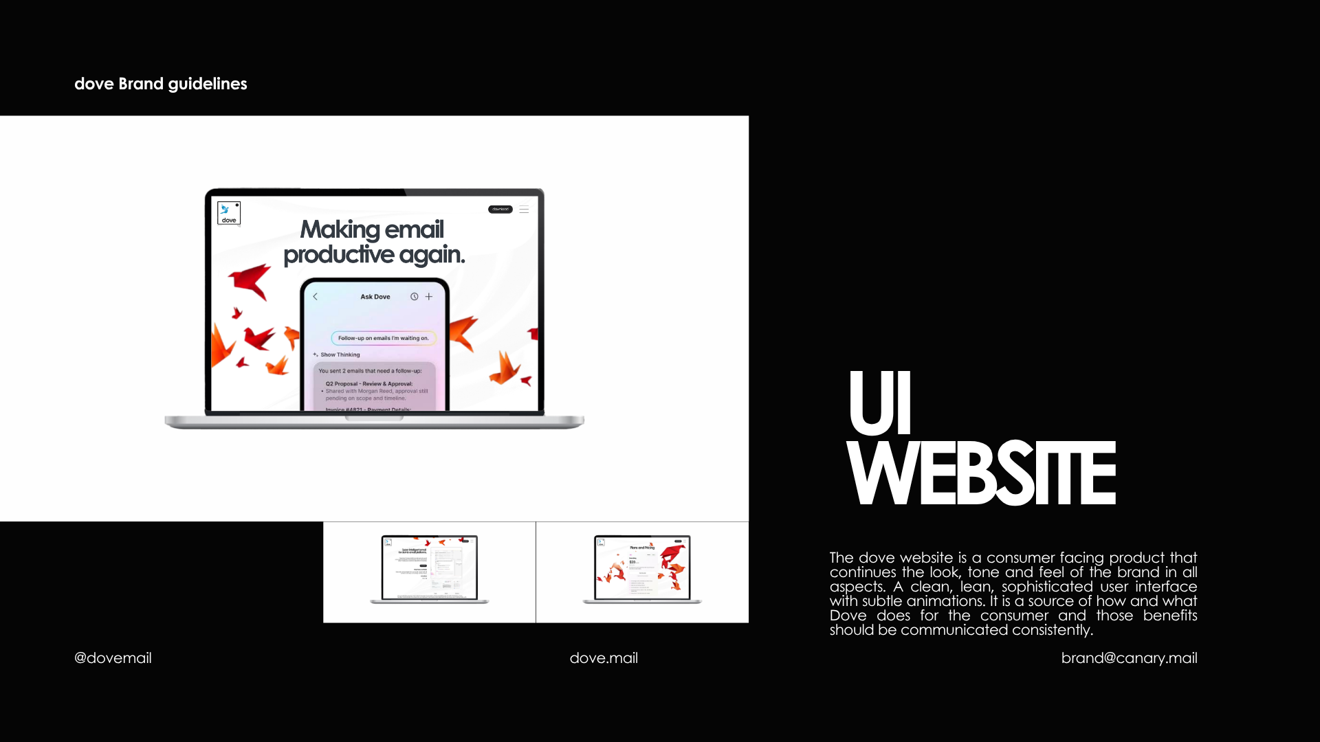
Canary Mail co-founder Shoel Sanghani reached out about their new product Dove in April of 2026. I have been a long time user of Canary Mail and major advocate for PGP encryption which the product always us to implement independently or through the platform. Canary Mail has been the secure cross-platform email client for millions of users across Apple and other platforms. With the launch of Dove that is not changing. Dove is a separate product from the same team, built to solve a different problem - inbox triage and attention management for high-volume email. Dove automatically sorts every email into Focus, Feed, Noise, or Done - no manual rules, no lengthy setup required. Dove works with Gmail, Microsoft 365, and IMAP and connects to your existing account In short - Dove handles inbox triage, while Canary Mail remains the secure cross-platform email client with AI.
The innovative tech company had really done it again, solving issues the big four email providers had not. The challenge was giving Dove a unique, ownable look and feel while defining the product to users that had recently been bombarded with Artificial Super Intelligence and Data Centers for the last few years.
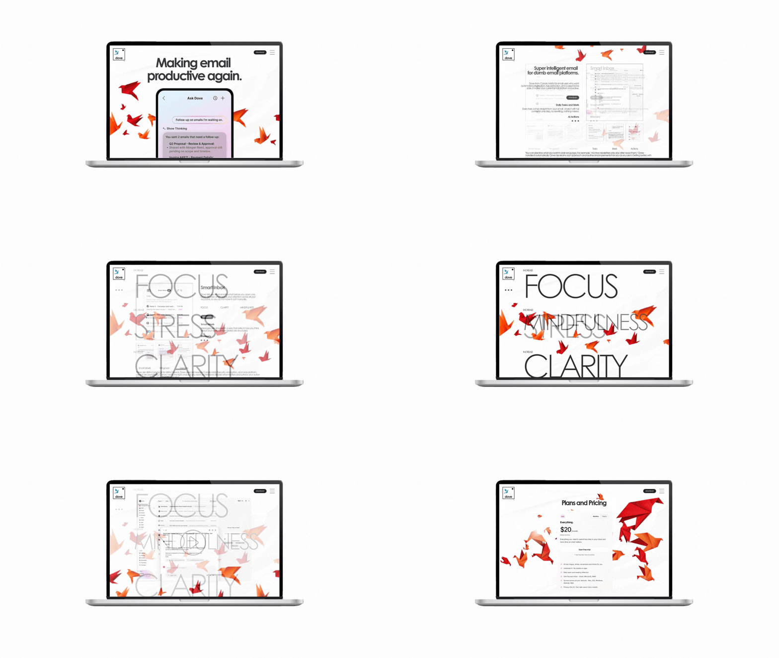
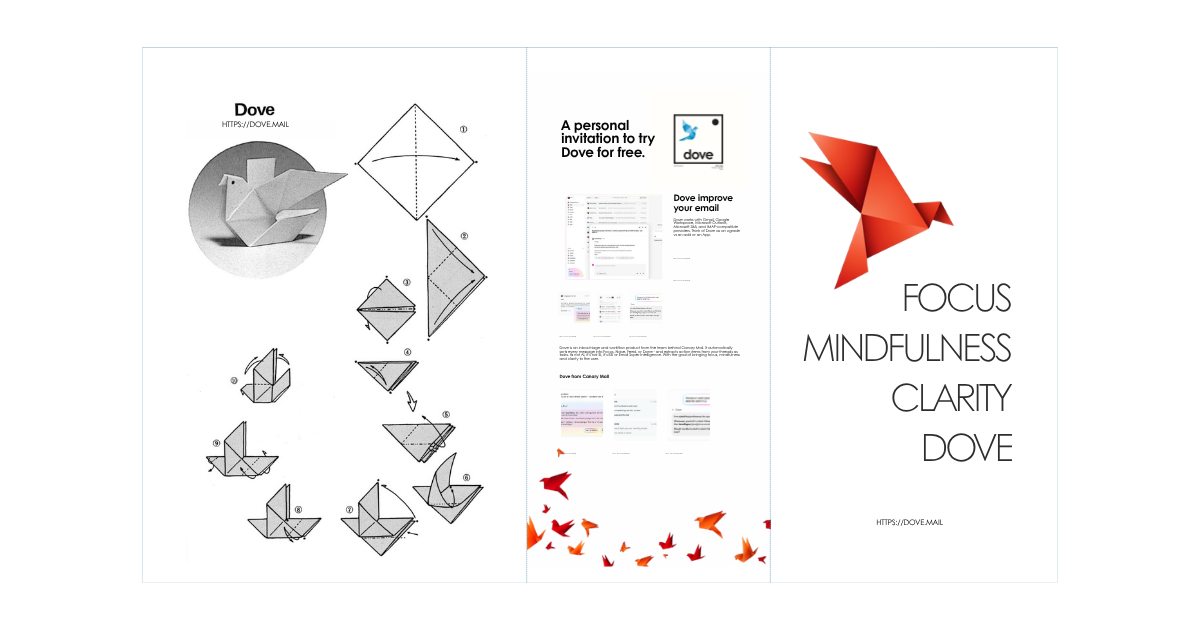
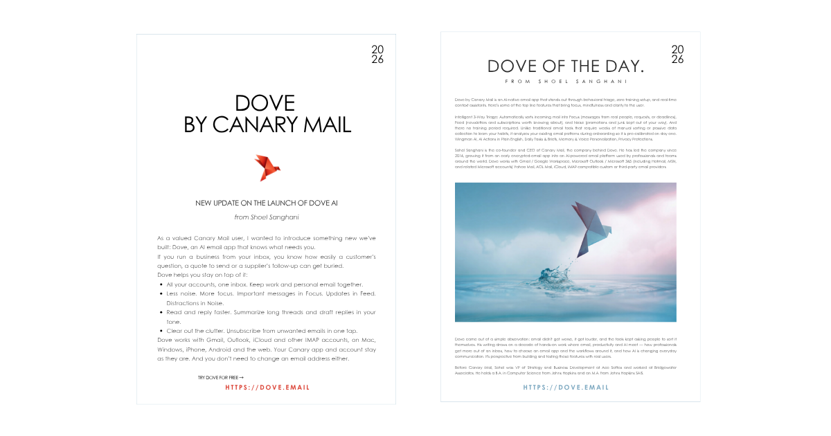
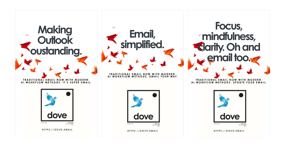
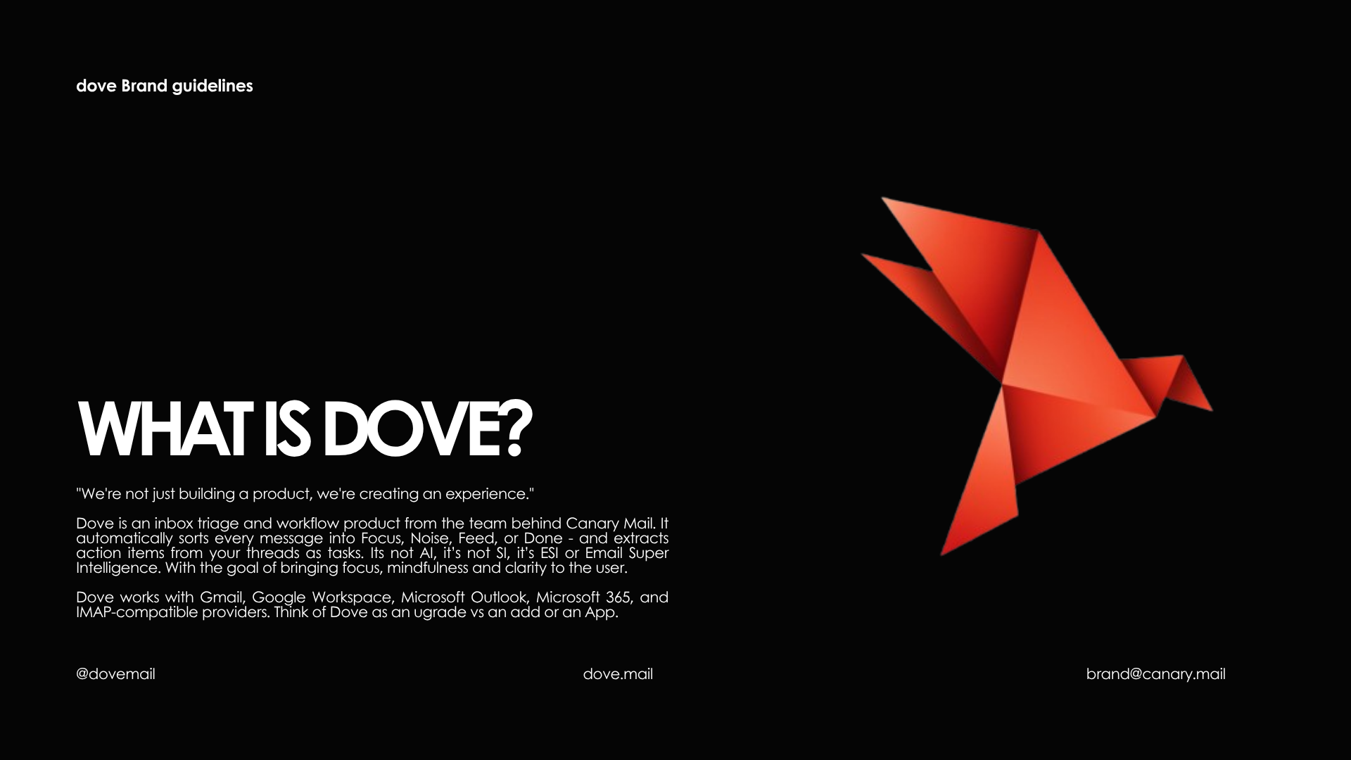
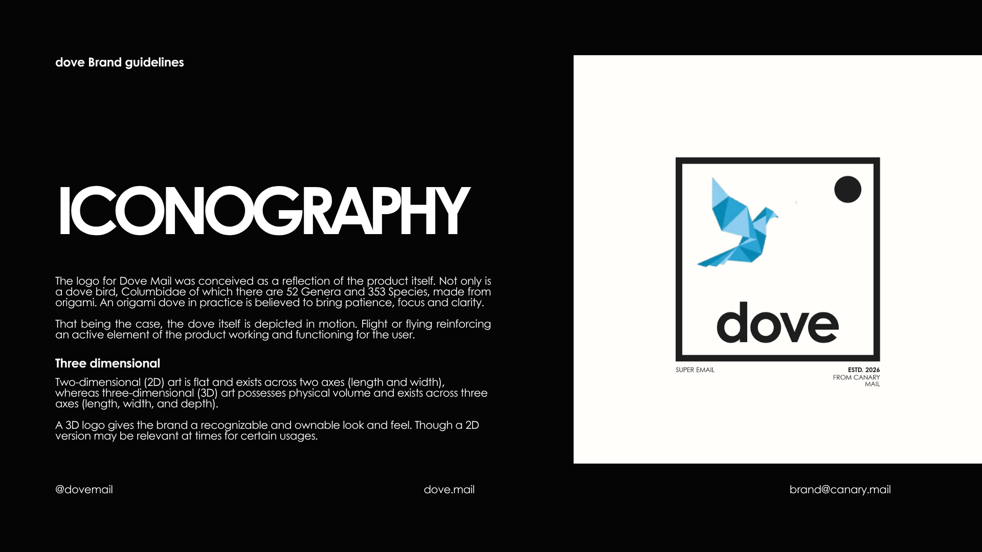
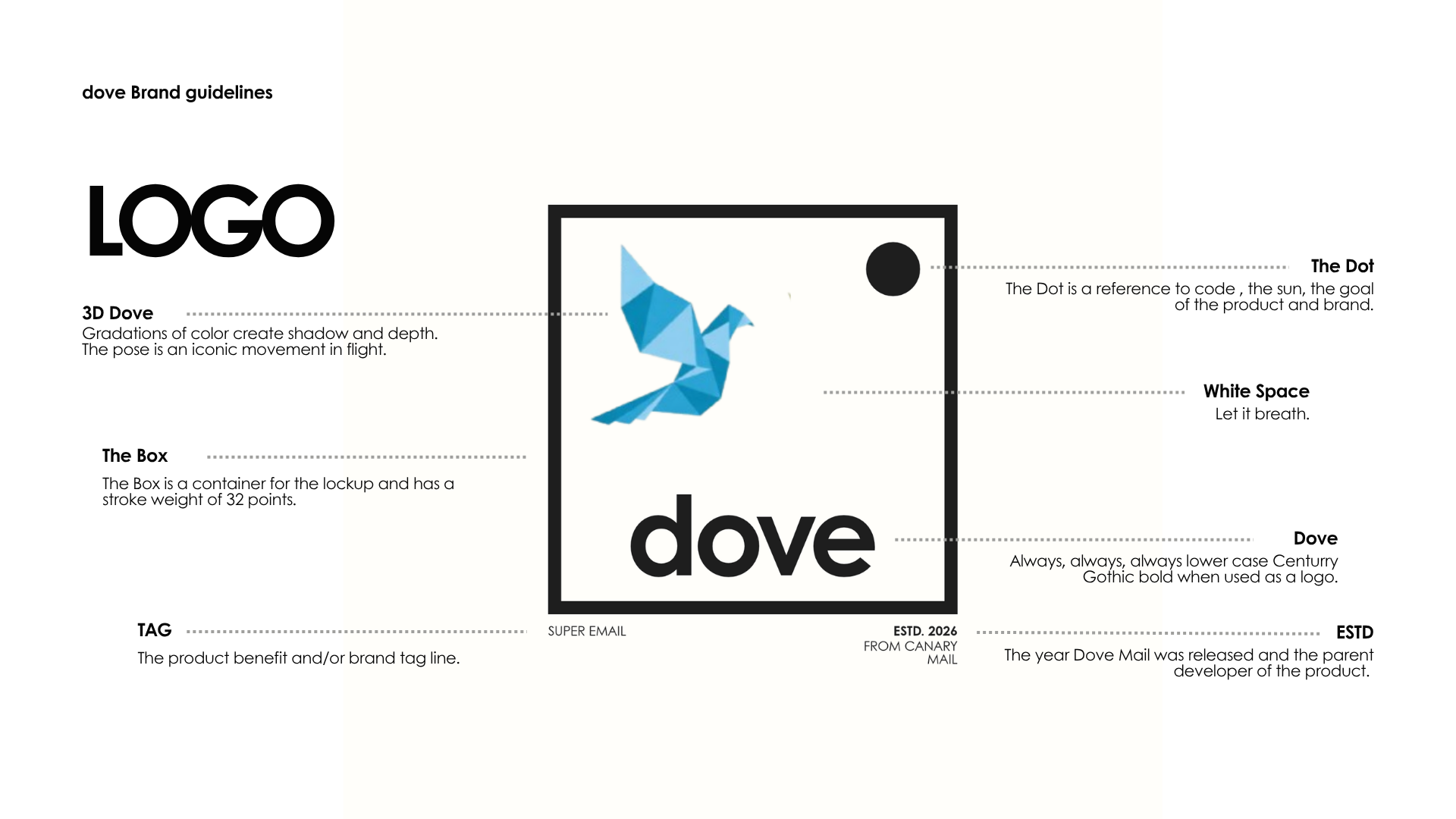
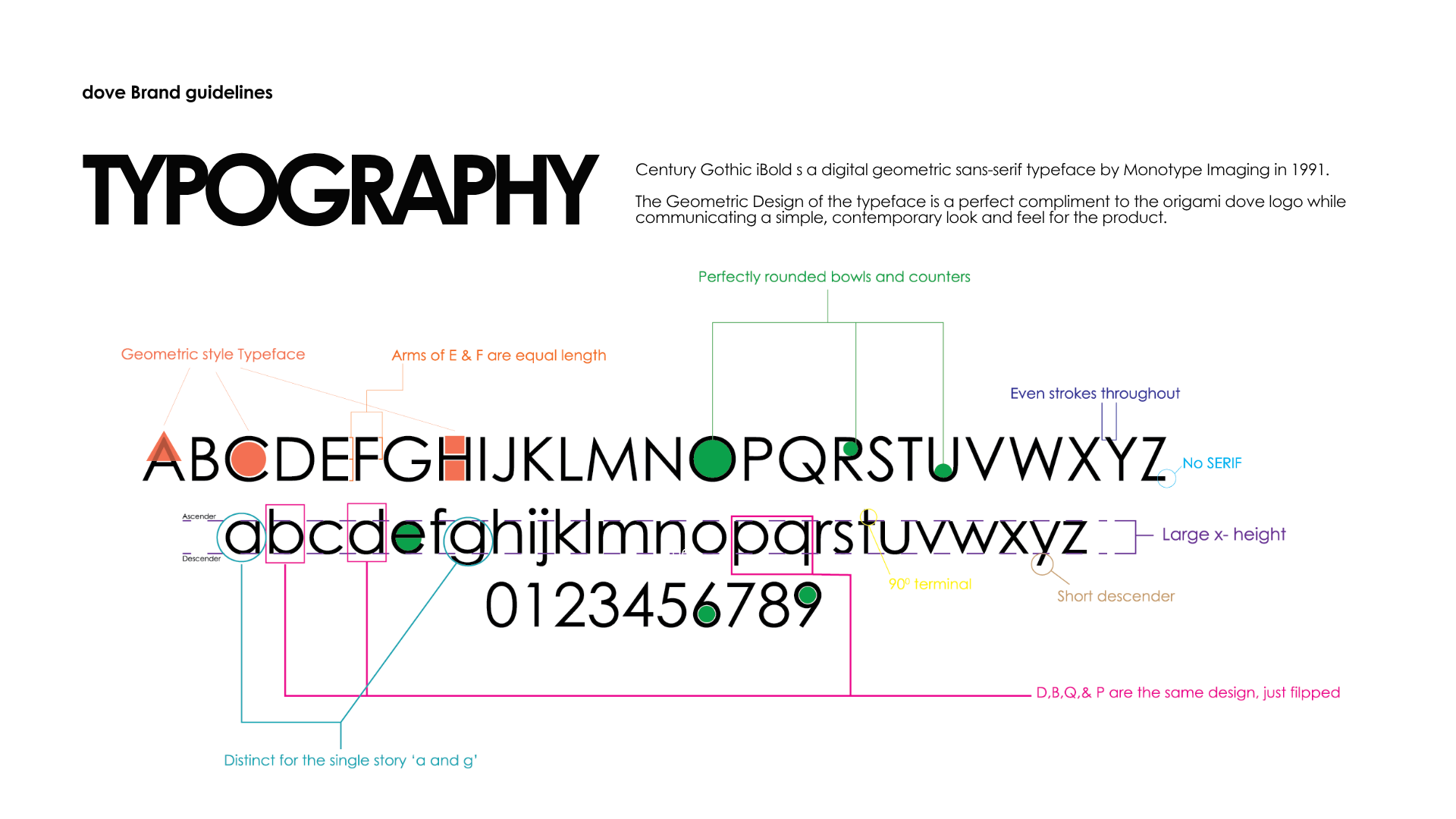
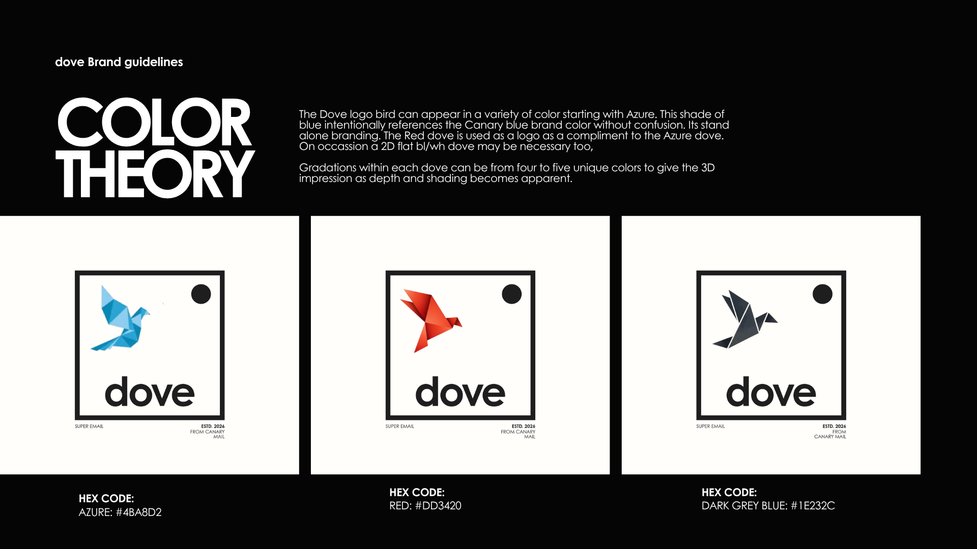
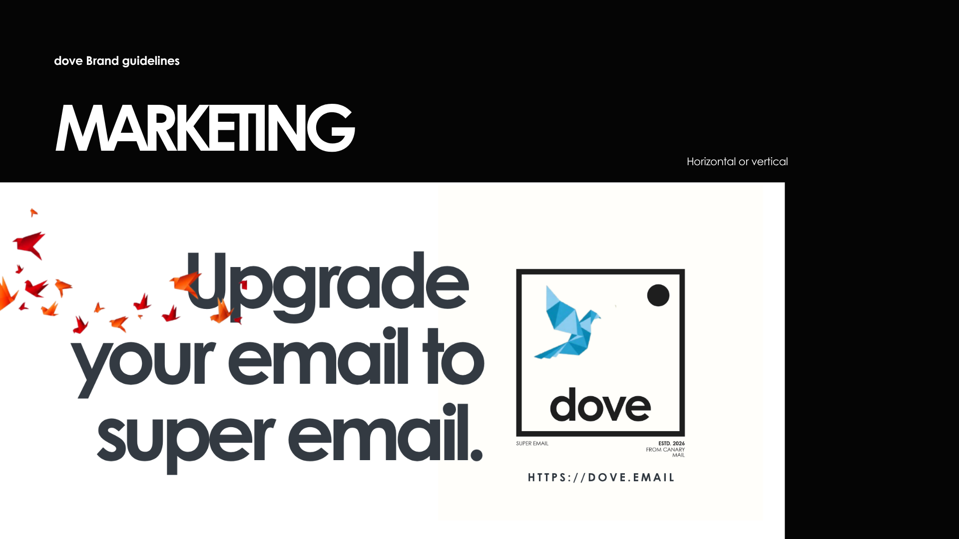
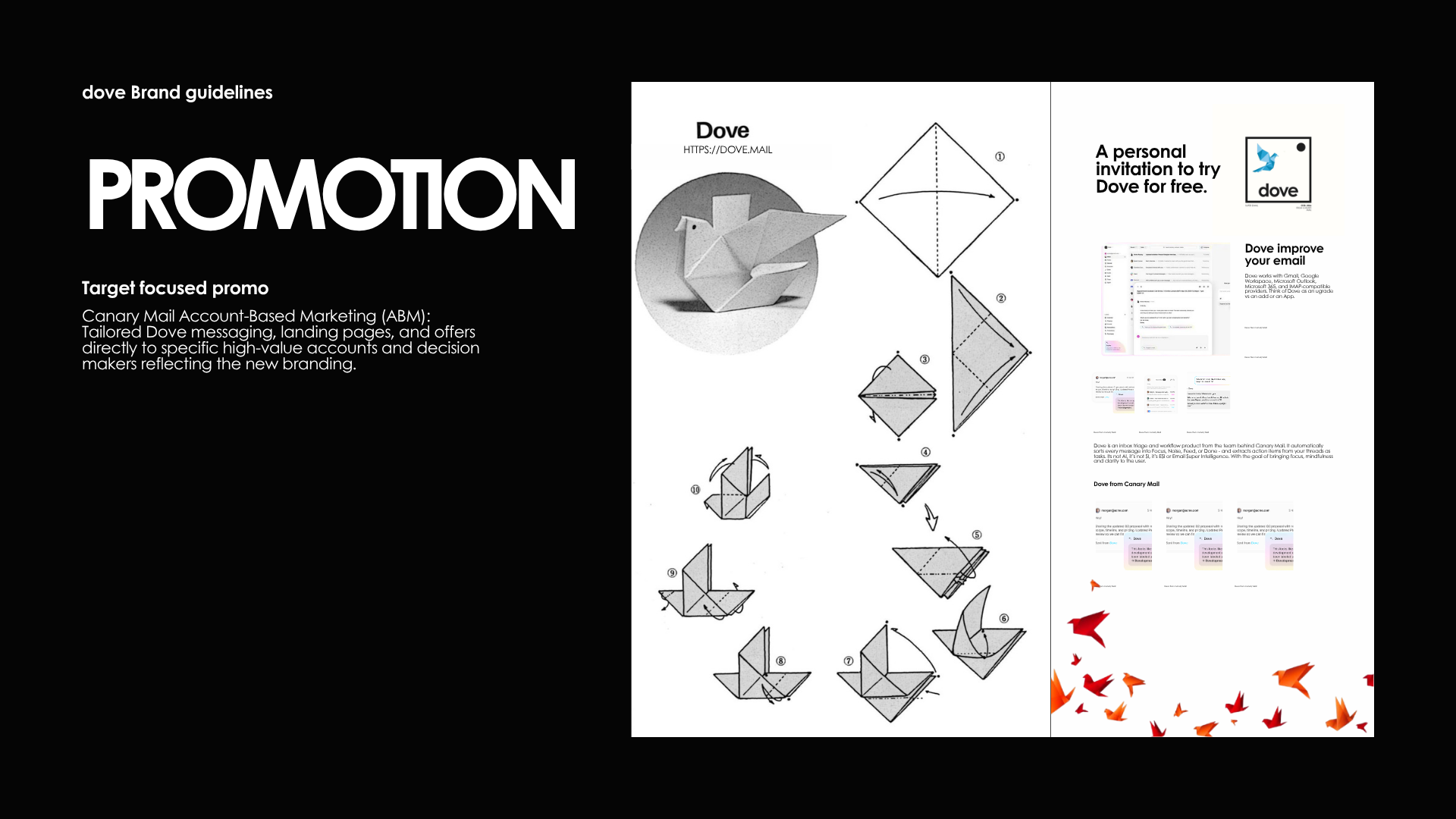
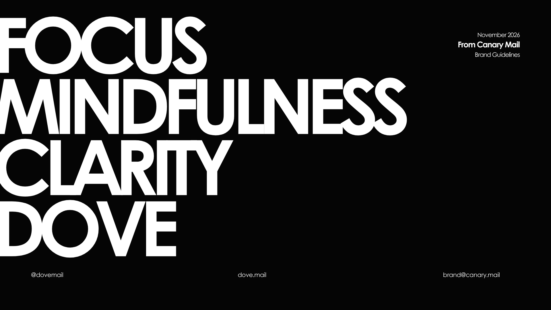
Strategically when you think beyond the list of product benefits, Dove brings a sense of calm to the overwhelming nature of email today. This brought the Japanese practice of origami to mind which for thousands of years gained patience, focus and clarity to the practitioner. An origami Dove would also bring a unique look and feel to the brand, matched with the Canary blue it would indirectly harken back to the parent company. Using a typeface that matched the new logo geometrically tie the two together and then we simplified executions to typography and branding. This created an ownable and noticeable clean look and feel which helped consumers see the product for what it was and how it benefited them. Instead of a traditional tag line we opted for support points: Clarity, mindfulness and focus. Truths to the user and product.
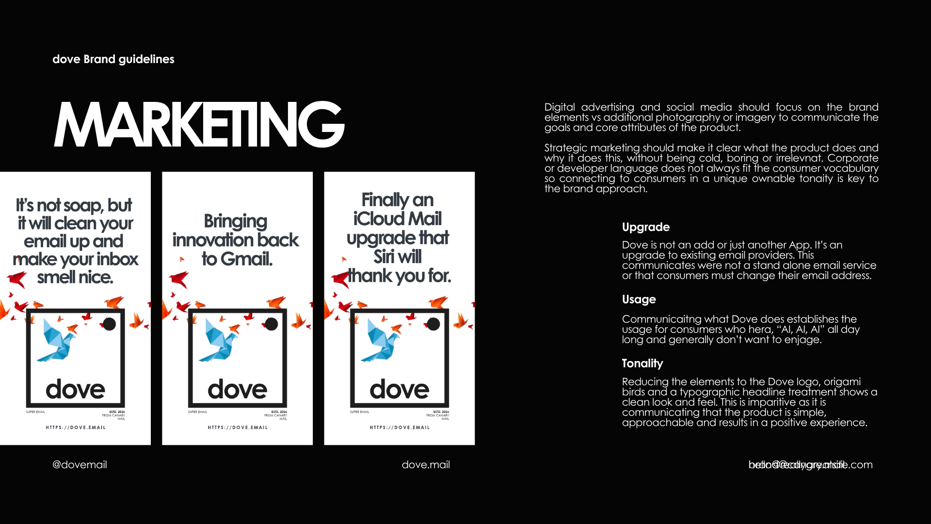
Display ads feature simple typography and iconographic based visuals. Dimensionalizing the product to gain awareness. Internal communicaitons reflected the approach. Branding that was clean, clear and connected to potential consumers.
Branding:
TBD
Sales impact:
TBD
Hiby R4 rebrand results:
TBD